© MAX PALATE CATERING
Max Palate
2021
Playful branding for an independent catering company that fuses together global flavours.
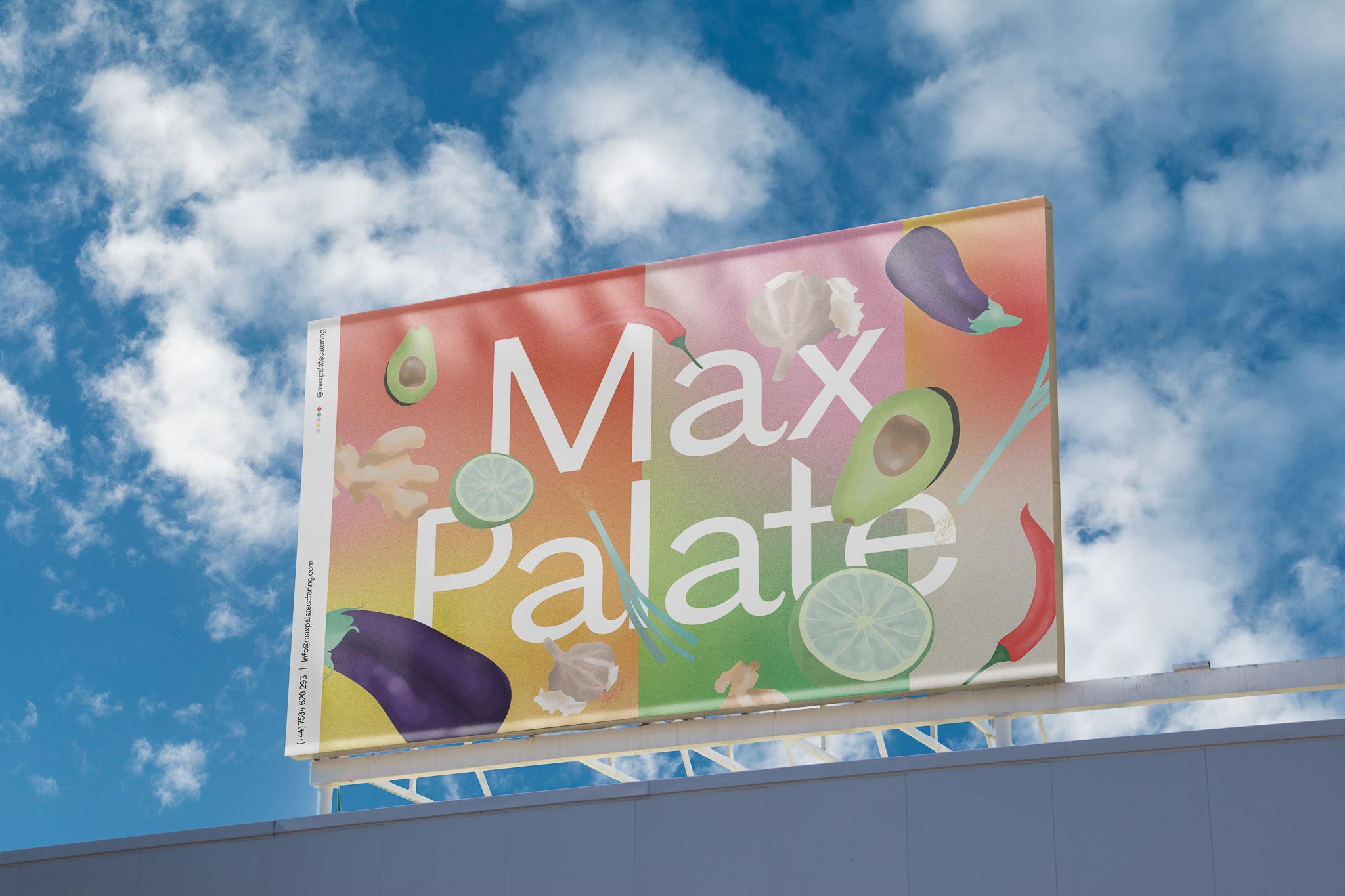
Max Palate Catering serves up a modern and healthy take on Eastern, South East Asian and Middle-Eastern cuisines. The new business wanted a contemporary brand image to give a fresh and healthy feel to the catering they were bringing to the table. The resulting design direction was playful and open to shifting and changing in line with the seasonal menu.
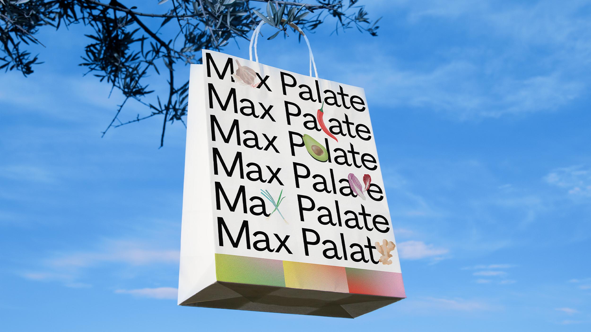
A series of illustrative assets of various vegetables were used, each which could be integrated into the lettering to evoke type. The business was named after Max, the founder’s son, and the design nods toward this origin by stylistically resonating with children’s books like The Very Hungry Caterpillar. A 5 colour gradient palette of red, pink, green, grey and yellow was employed to represent the five flavour profiles - spicy, sweet, sour, salty and umami. These colours were then built into a grid that could be altered for different branding needs, whether it be menus, business cards, email templates, packaging or social media layouts. The resulting identity is versatile and infused with flavour and character.
A series of illustrative assets of various vegetables were used, each which could be integrated into the lettering to evoke type. The business was named after Max, the founder’s son, and the design nods toward this origin by stylistically resonating with children’s books like The Very Hungry Caterpillar. A 5 colour gradient palette of red, pink, green, grey and yellow was employed to represent the five flavour profiles - spicy, sweet, sour, salty and umami. These colours were then built into a grid that could be altered for different branding needs, whether it be menus, business cards, email templates, packaging or social media layouts. The resulting identity is versatile and infused with flavour and character.