
GREEN REFUGE
ARTS AND CULTURE | 2023
Art direction and visual identity for Green Refuge, an augmented reality heritage trail commissioned for London Festival of Architecture 2023.
Introduction
Green Refuge was commissioned for the London Festival of Architecture 2023, transforming Clapham Common into a living archive of sanctuary stories — from Blitz-era shelters to the Caribbean communities of the Windrush generation who made the common their own across decades. The project asked a question that felt urgent and personal: what does a place remember, and who gets to tell that story? It was one of the most considered briefs this studio has worked with — a commission that sat at the intersection of heritage design, environmental storytelling, and community history.
Green Refuge was commissioned for the London Festival of Architecture 2023, transforming Clapham Common into a living archive of sanctuary stories — from Blitz-era shelters to the Caribbean communities of the Windrush generation who made the common their own across decades. The project asked a question that felt urgent and personal: what does a place remember, and who gets to tell that story? It was one of the most considered briefs this studio has worked with — a commission that sat at the intersection of heritage design, environmental storytelling, and community history.
Services
Bespoke Logotype
Brand Identity and Direction
Printed Ephemera
Signage
Web Design
Bespoke Logotype
Brand Identity and Direction
Printed Ephemera
Signage
Web Design


The Challenge
The brief was to create an augmented reality heritage trail that could hold the weight of these histories without flattening them. Reading deeper into the stories of displacement, climate crisis, and the relationship between Black and Brown communities and green space in Britain, it became clear that the design couldn't just illustrate these narratives. It had to be shaped by them. The typography needed to feel like it had grown from the ground itself — not applied to the landscape, but drawn out of it. Environmental illustration for public space carries a particular responsibility: the people whose histories you are representing will stand in the same place the work inhabits.
The Solution
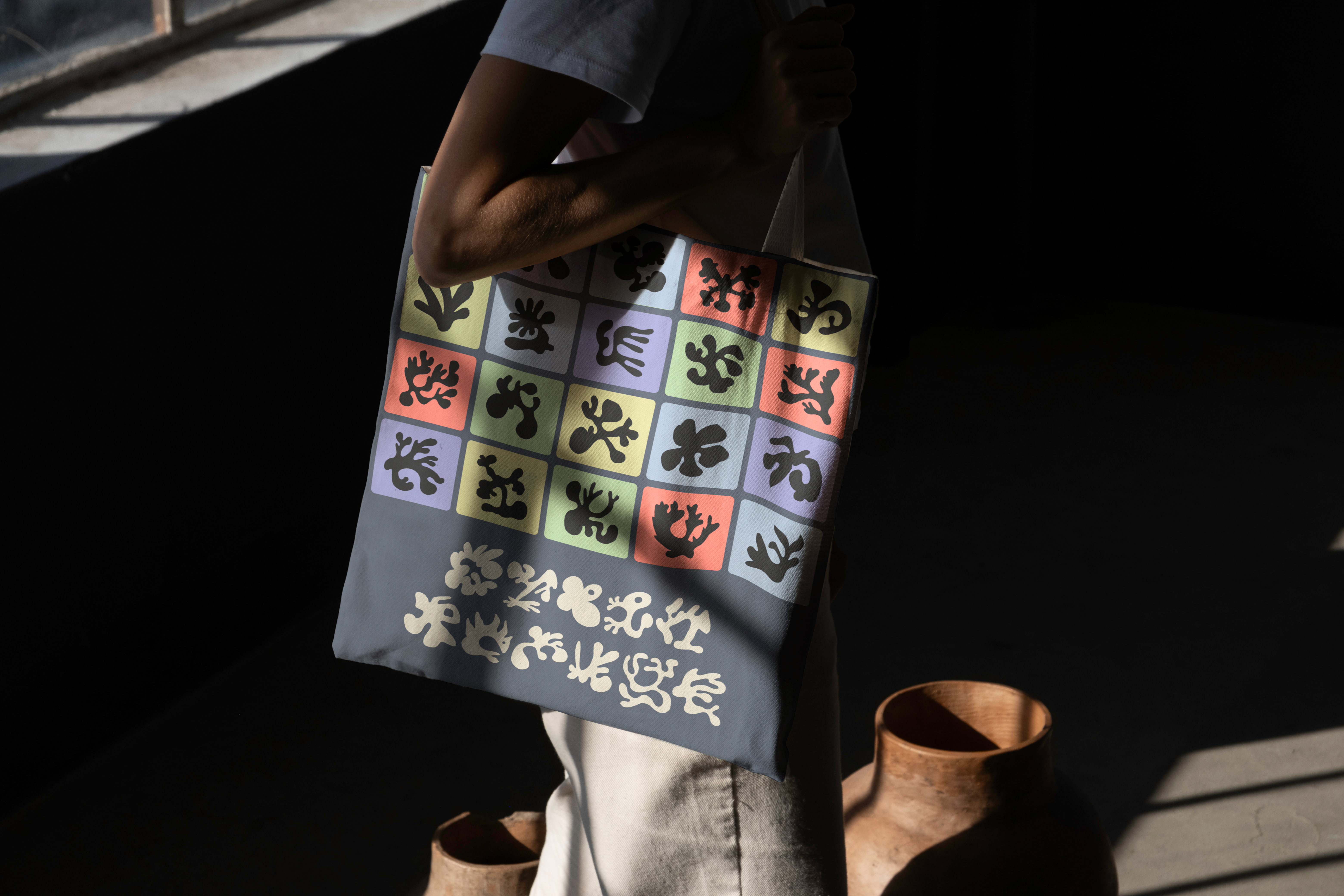
A custom typeface was developed from the common's own flora — cow parsley, dock, wildgrass — letting the landscape author its own visual identity. Type as testimony. Each letterform carries something of the place it came from, making the act of reading itself a kind of attention.
The augmented reality layer allowed stories to surface only in place, only in context, honouring the specificity of where these histories actually lived. This wasn't illustration applied to a space — it was design that could only exist in that space, inseparable from the ground it stood on. The result was a piece of public graphic design and environmental storytelling that moved between the physical and the digital without losing the weight of either. Design as reciprocity: the common had sheltered people across centuries. This was a small way of sheltering it back.
The brief was to create an augmented reality heritage trail that could hold the weight of these histories without flattening them. Reading deeper into the stories of displacement, climate crisis, and the relationship between Black and Brown communities and green space in Britain, it became clear that the design couldn't just illustrate these narratives. It had to be shaped by them. The typography needed to feel like it had grown from the ground itself — not applied to the landscape, but drawn out of it. Environmental illustration for public space carries a particular responsibility: the people whose histories you are representing will stand in the same place the work inhabits.
The Solution
A custom typeface was developed from the common's own flora — cow parsley, dock, wildgrass — letting the landscape author its own visual identity. Type as testimony. Each letterform carries something of the place it came from, making the act of reading itself a kind of attention.
The augmented reality layer allowed stories to surface only in place, only in context, honouring the specificity of where these histories actually lived. This wasn't illustration applied to a space — it was design that could only exist in that space, inseparable from the ground it stood on. The result was a piece of public graphic design and environmental storytelling that moved between the physical and the digital without losing the weight of either. Design as reciprocity: the common had sheltered people across centuries. This was a small way of sheltering it back.


