BIOPHILIA
ENVIRONMENT | 2019
Holding space for ecological grief through experimental book design.
Introduction
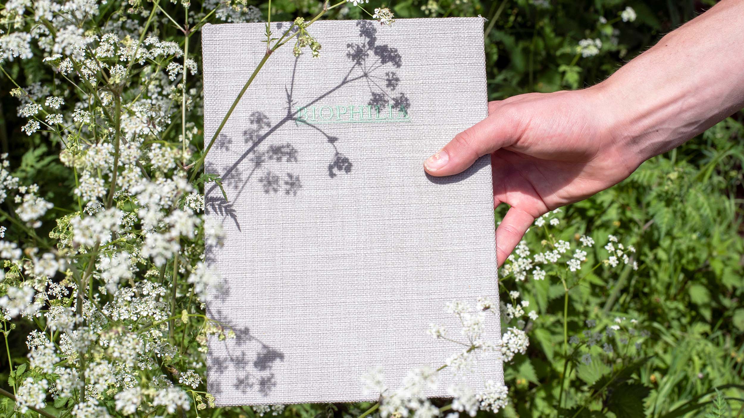
Biophilia began personally, as most honest projects do. The word itself — the hypothesis that humans hold an innate need to connect with other living systems — felt like both a diagnosis and a direction. This self-published editorial design project was an attempt to make that connection tangible: to create an object that didn't explain our relationship to nature so much as recreate the feeling of it. It sits in a tradition of design that takes the physical seriously, where material choices aren't aesthetic decisions so much as arguments.
Services
Art Direction
Book Design
Art Direction
Book Design

The Challenge
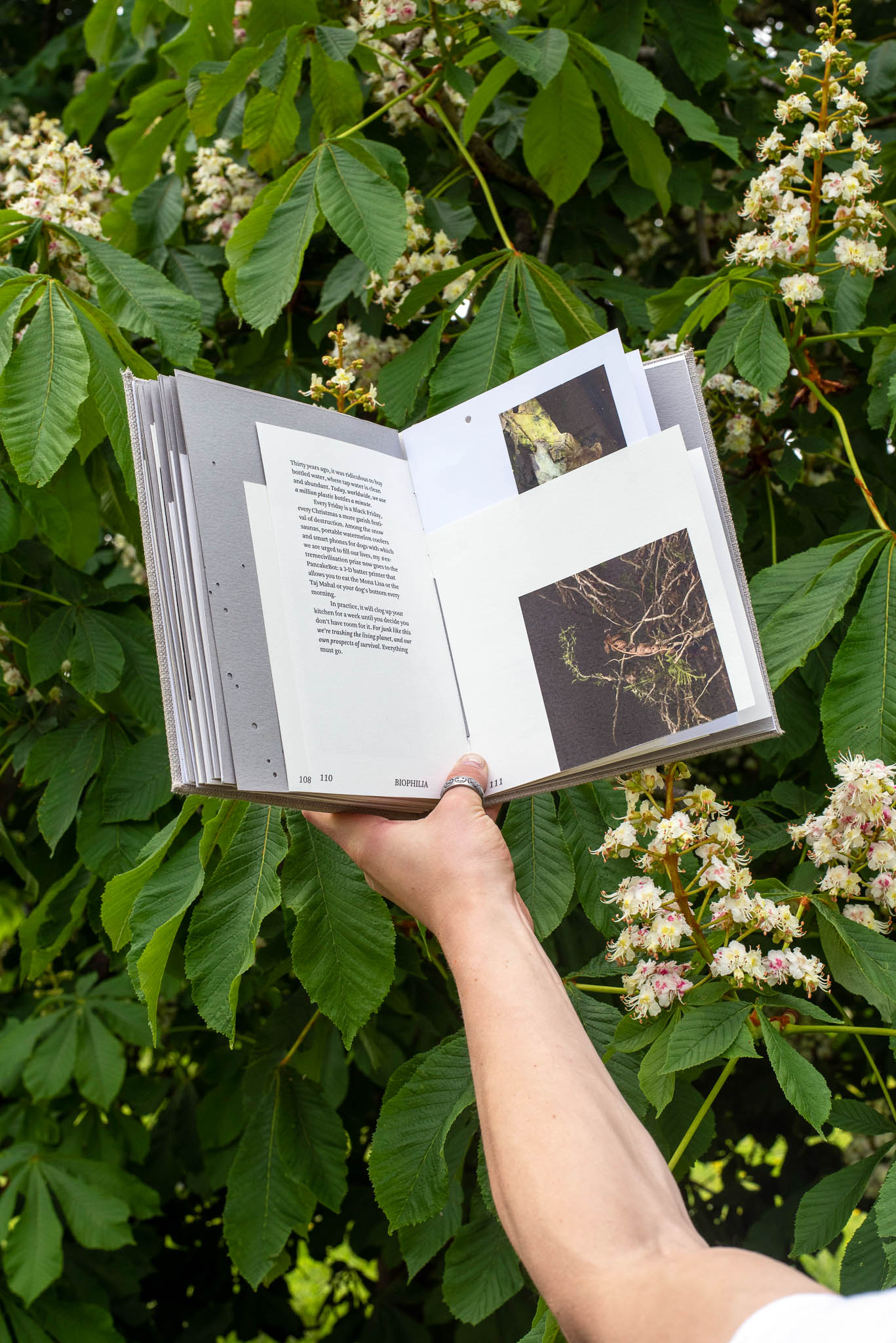
The project occupied an uncomfortable and generative space between academic inquiry and emotional document — a difficult tension to hold in a single publication. Drawing on the writing of environmental thinkers including George Monbiot and Andrew Balmford, alongside found imagery gathered from Somerset's woodlands and flora collected by hand, scanned and photographed, the challenge was to make something rigorous without making something cold. Environmental design and illustration can easily become earnest, can reduce complex ecological grief to a visual checklist of leaves and data points. The ambition here was the opposite: to make a book that made you feel the loss before you understood it.
The Solution
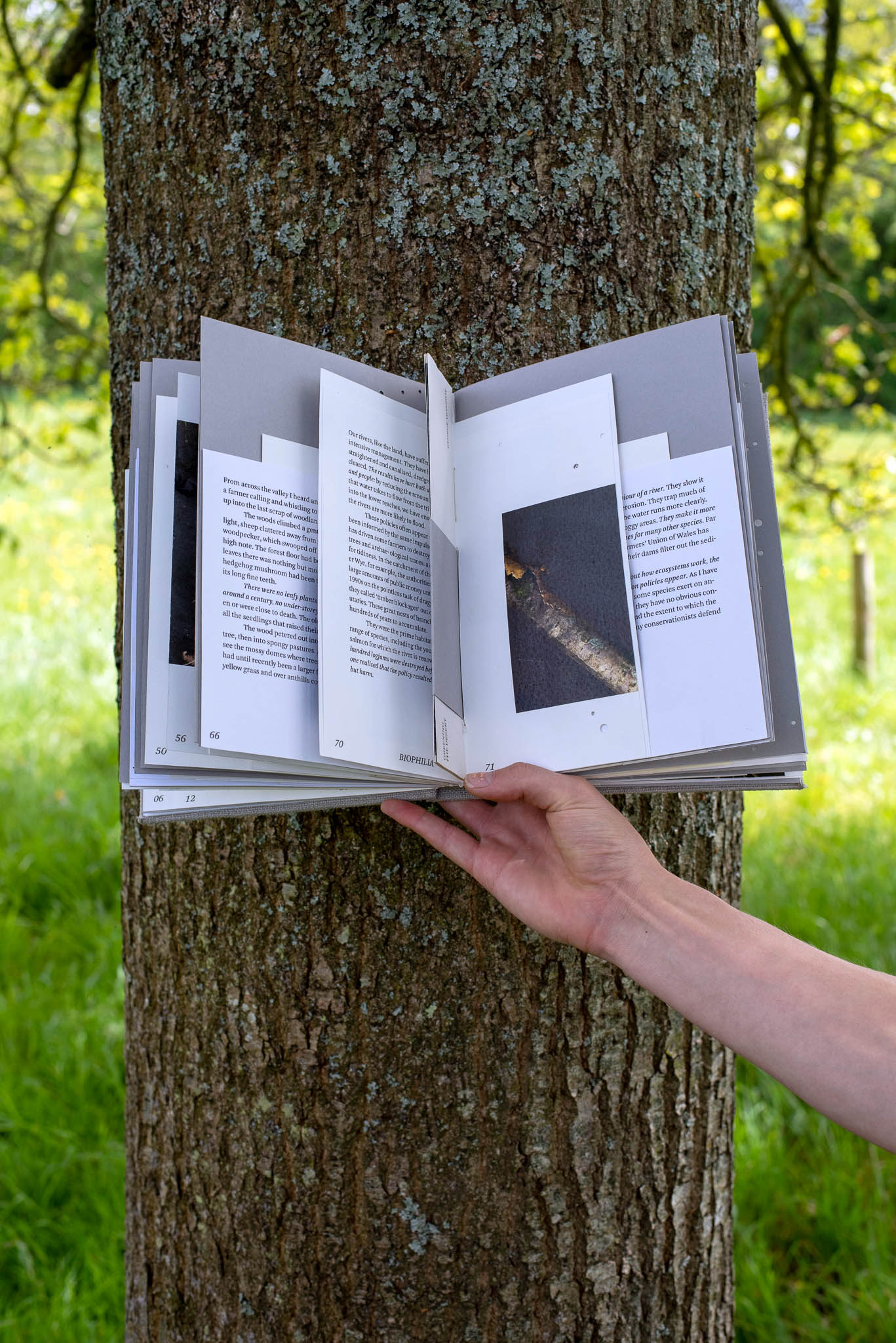
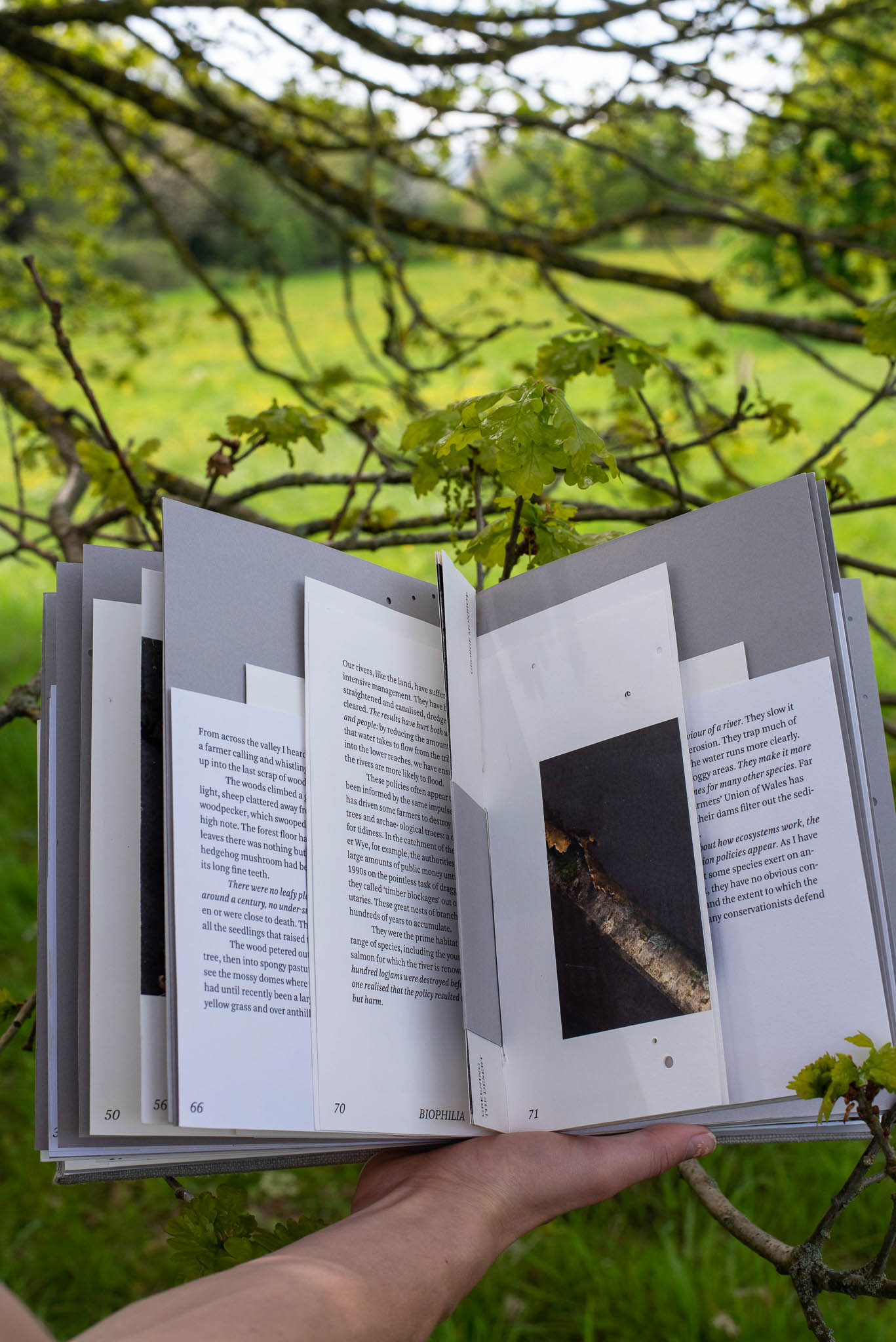
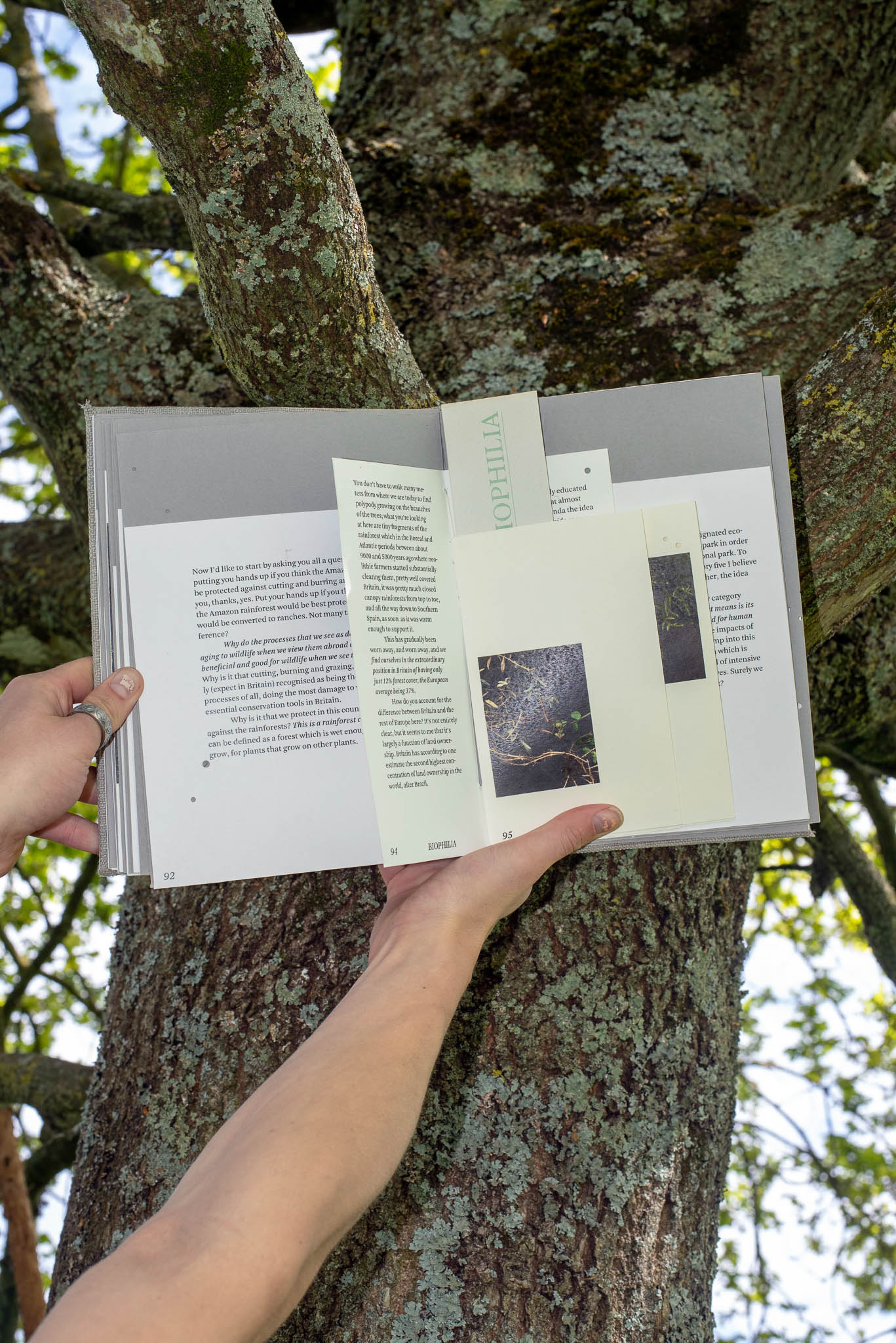
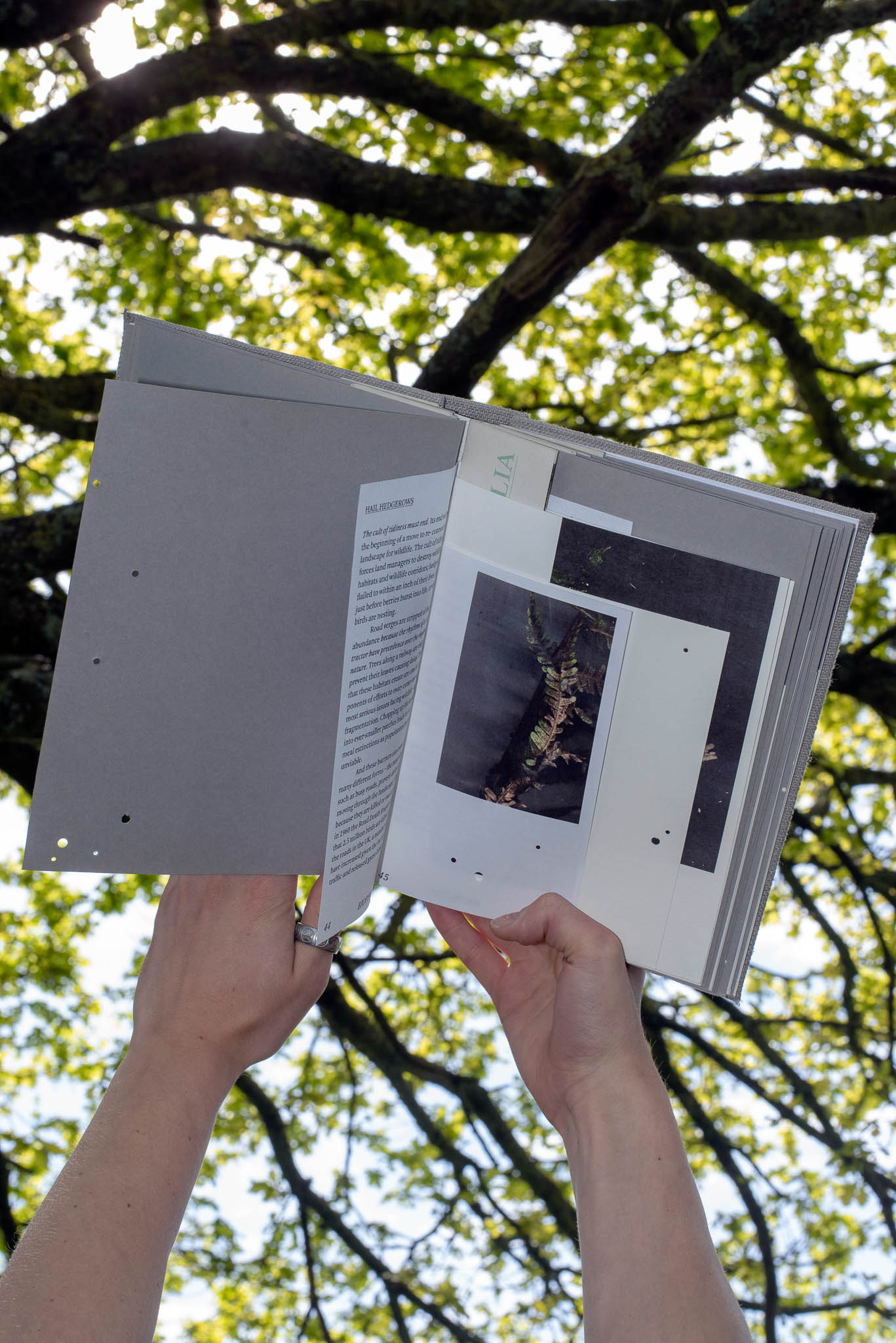
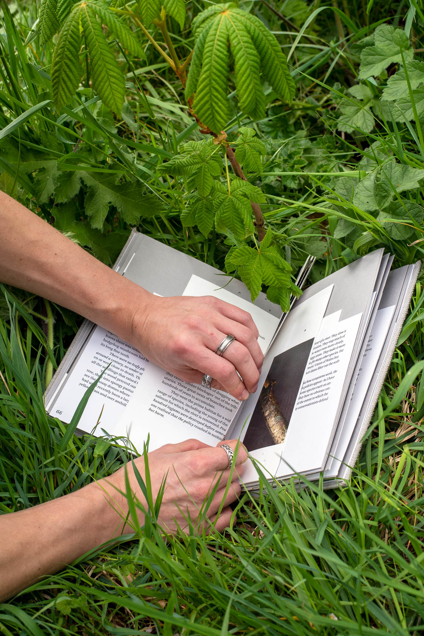
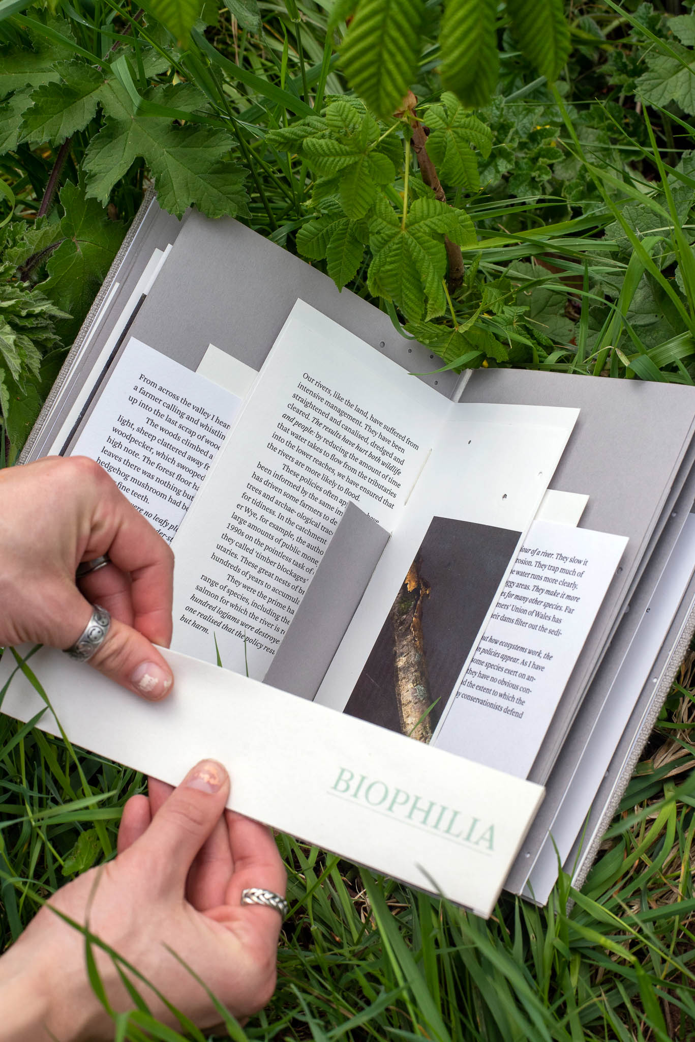
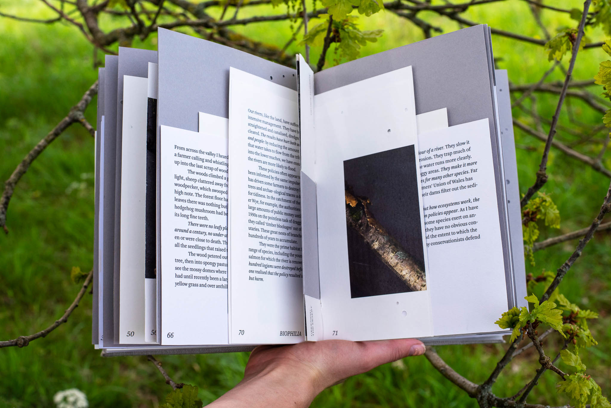
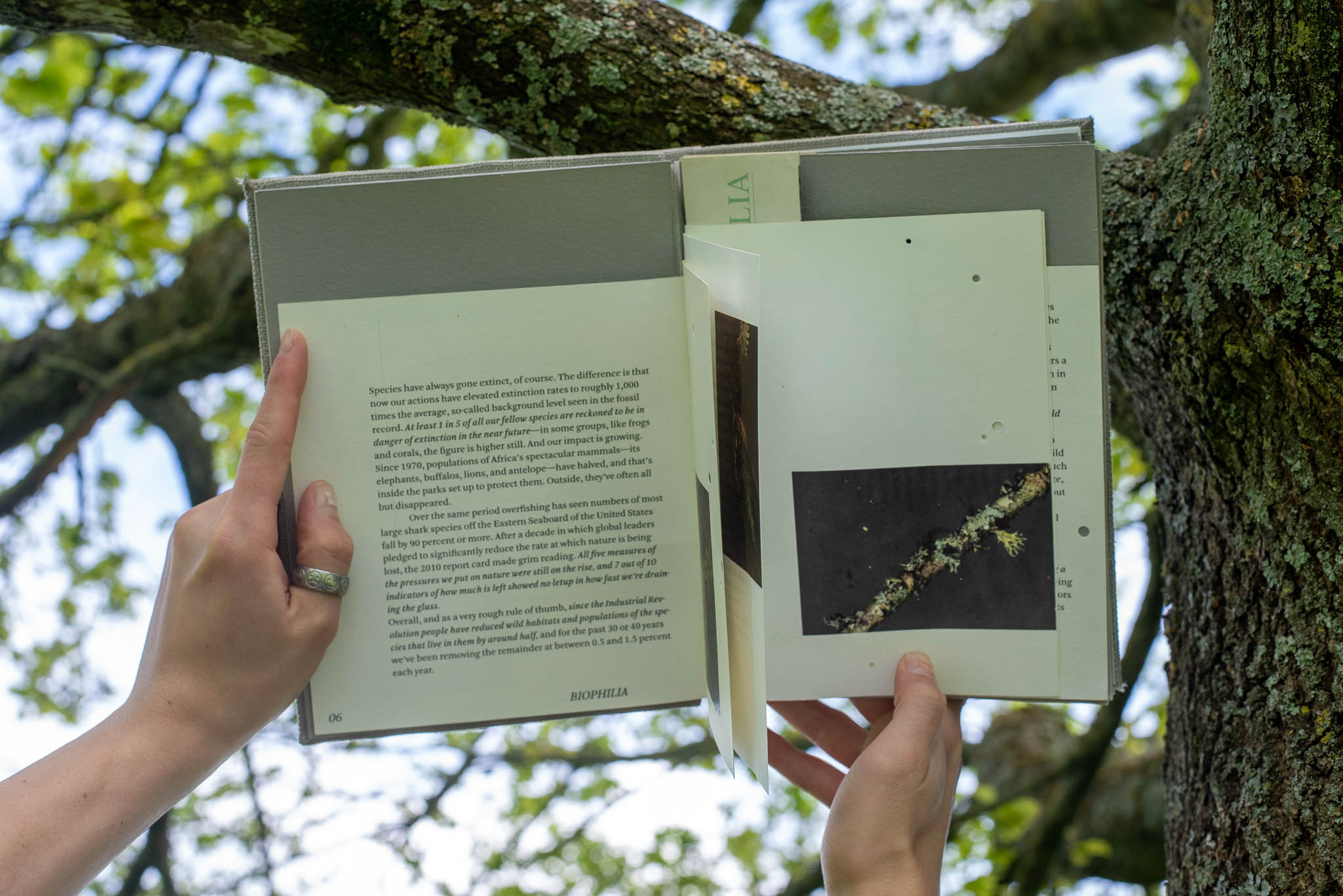
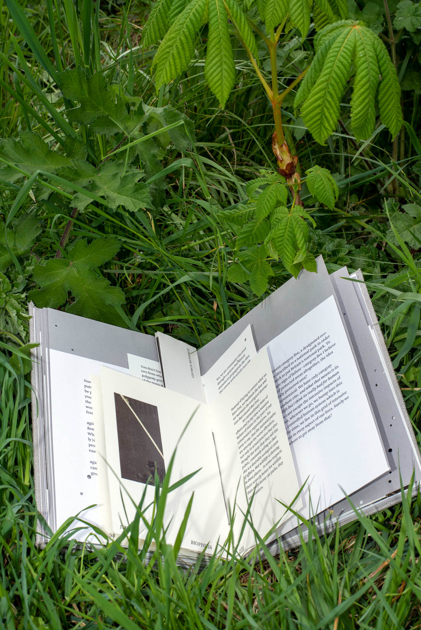
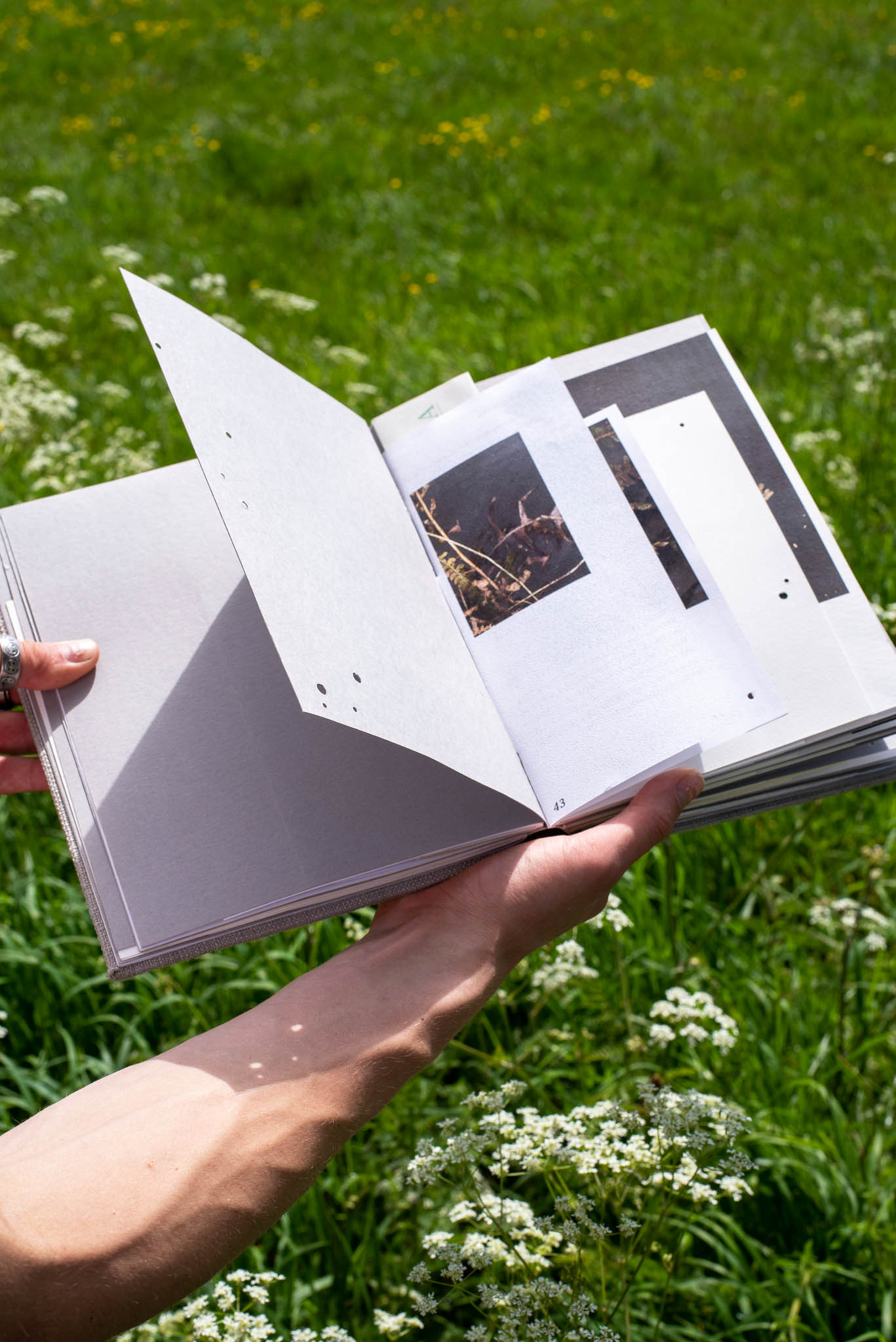
The physical construction of the publication was as considered as its content. Four different paper stocks shift across the book, each chosen to evoke a different quality of the natural world — the rough, the translucent, the dense, the fragile. Pages are pierced with holes that accumulate as you move through the publication, representing degradation and loss as something you feel in your hands rather than just read about. This is editorial design working at the level of sensation, not just communication.
In the UK, the relationship to biodiversity is quieter and more easily overlooked than most other places in the world— and it required a design language equally nuanced. Each chapter forms around a central bind but unfolds into a poster, asking the reader to actively change their relationship with the page as they move through it. The result is a piece of environmental editorial that functions as both publication and object: something to be held, unfolded, and returned to. A piece of graphic design made in response to the natural world, and in some small way, on its behalf.
The project occupied an uncomfortable and generative space between academic inquiry and emotional document — a difficult tension to hold in a single publication. Drawing on the writing of environmental thinkers including George Monbiot and Andrew Balmford, alongside found imagery gathered from Somerset's woodlands and flora collected by hand, scanned and photographed, the challenge was to make something rigorous without making something cold. Environmental design and illustration can easily become earnest, can reduce complex ecological grief to a visual checklist of leaves and data points. The ambition here was the opposite: to make a book that made you feel the loss before you understood it.
The Solution
The physical construction of the publication was as considered as its content. Four different paper stocks shift across the book, each chosen to evoke a different quality of the natural world — the rough, the translucent, the dense, the fragile. Pages are pierced with holes that accumulate as you move through the publication, representing degradation and loss as something you feel in your hands rather than just read about. This is editorial design working at the level of sensation, not just communication.
In the UK, the relationship to biodiversity is quieter and more easily overlooked than most other places in the world— and it required a design language equally nuanced. Each chapter forms around a central bind but unfolds into a poster, asking the reader to actively change their relationship with the page as they move through it. The result is a piece of environmental editorial that functions as both publication and object: something to be held, unfolded, and returned to. A piece of graphic design made in response to the natural world, and in some small way, on its behalf.