©BEAN & GONE
Bean and Gone
2023

Brand identity and motion design for Bean and Gone, a climate-conscious candle company built on principles of reuse and sustainable materials.
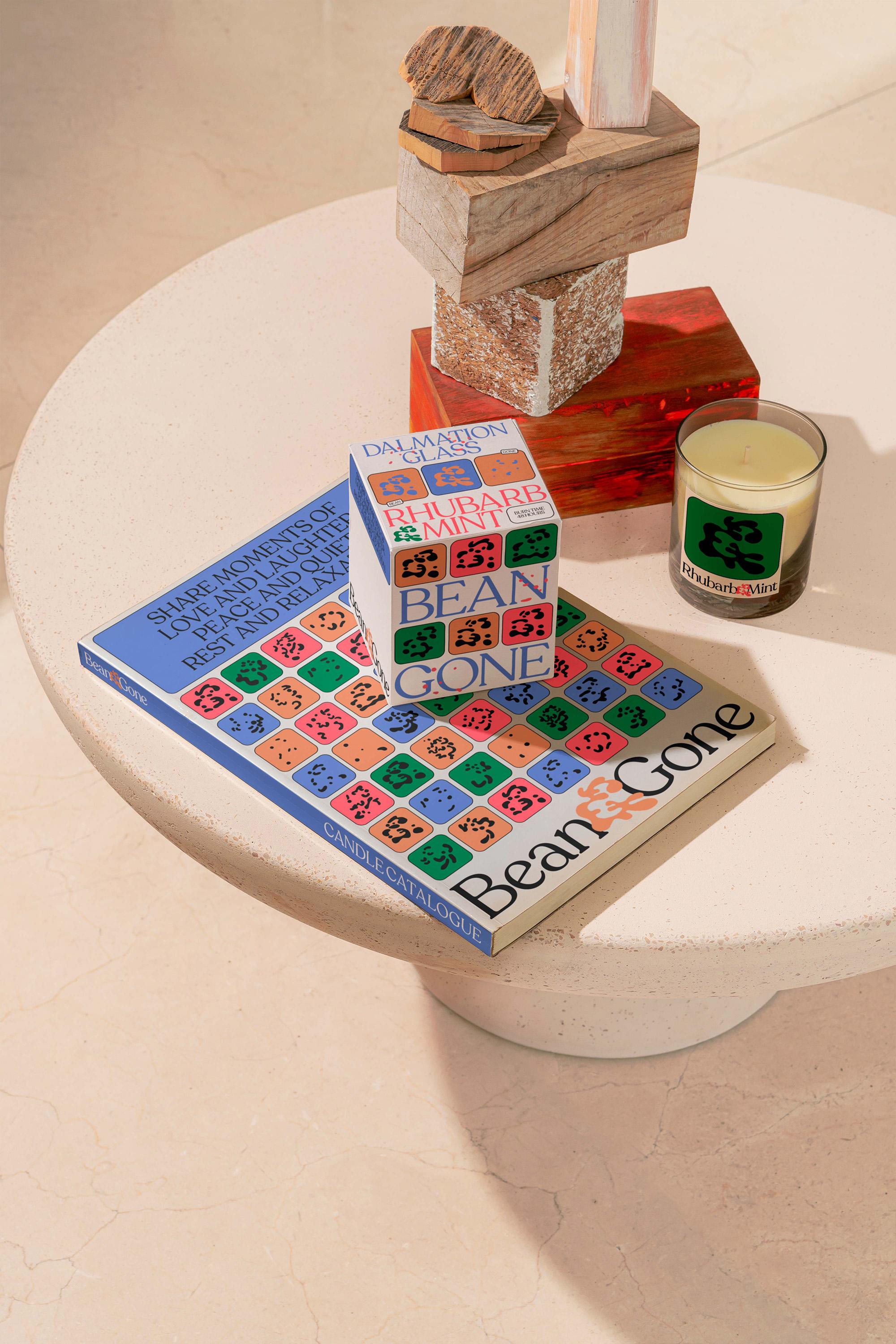
Bean and Gone creates soy-based candles in reusable vessels—an approach that challenges the disposability of conventional home goods. The brand needed a visual language that honoured both the sensory experience of their product and their environmental commitments.
The identity centres on 'scent symbols'—abstract motifs derived from smoke forms that create a unique visual signature for each fragrance. These fluid, organic shapes evolved into a complete design system: packaging, motion pieces, and brand communications that feel warm, playful, and alive. The ampersand became a unifying element, emphasising the moments of connection and shared experience that candles facilitate.
The result is a brand that feels premium without preciousness—sustainable design that celebrates joy and intimacy rather than lecturing about impact.